Mobile-First Approach: Optimizing for the Smartphone User Experience
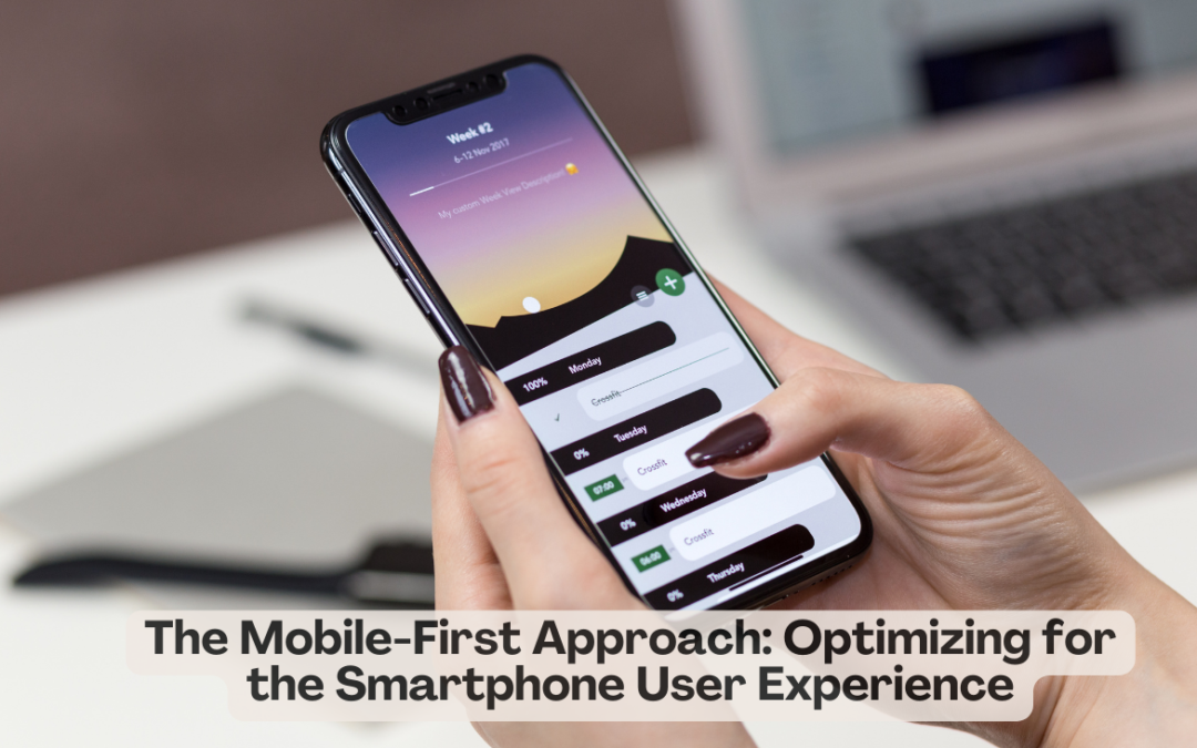
Web design strategy often starts with a mobile-first approach due to the overall use of smartphones. This strategy highlights the user experience on the phone because people mostly search for materials, view content and do business on the cell phone. The article under discussion will discuss the mobile-first approach and why it is crucial to design a hassle-free smartphone user experience.
Understanding the Mobile-First Approach
Mobile-first is an approach in designing and developing for mobile devices first, followed by desktops and larger screens. The expanding trend of mobile use triggers this shift of emphasis. According to Statista, in 2022, the number of smartphone users exceeded 4.8 billion, which demonstrates the importance of smartphones in our lives as digital creatures.
The mobile-first approach entails:
Prioritising Mobile Users: The first and only thing to consider when designing websites, apps, or any other digital content is how it will look from a functional perspective when viewed on a mobile device. This approach makes the user experience suitable for small screens, the touch interface, and the different network conditions that are common on smartphones.
Progressive Enhancement: It starts simple for mobile users first and then adds advanced functionality and other design elements for larger screens.
The importance of the mobile-first approach
User-Centric Design: You will have prioritised your mobile users, making sure that you have put the user into the centre of the design process. In an environment with limited screen space and various interaction methods, the user experience must be made more straightforward and understandable.
Faster Loading Times: Mobile-first design focuses on using lightweight assets and optimised code. As a result, the pages load fast, which is of greatest importance for retaining mobile subscribers who, most of the time, access weak and slow networks.
Improved SEO: In its search results, Google and other search engines favour mobile-ready sites. You should welcome the mobile-first strategy because it may enhance your search visibility and SEO rankings.
Adaptability: This involves having a responsive and flexible design so that it fits well in mobile devices with a possibility of expansion into bigger screens. This gives guarantees that your content is friendly towards different devices.
Increased Conversions: A mobile-optimized website or app leads to better user engagement, lower bounce rates and higher conversions (making a purchase, subscribing, or consuming content).
The best practices for mobile-first design
Responsive Design: Be sure your website or app will fit different screen sizes and orientations, which should lead to a consistent and enjoyable experience for all devices.
Touch-Friendly Interfaces: Ensure that user interface elements are optimised for touch interactions, like tapping the buttons and navigating through the menu using a single finger.
Mobile-Friendly Content: Keep content simple for mobile devices with short text, selected graphics, and straightforward layouts.
Performance Optimization: Ensure good performance through image optimisation, minimising HTTP requests, and browser caching for faster loading.
Testing and User Feedback: Keep checking your design on different mobile devices, collect user feedback and look out for usability concerns as well as areas that need improving.
In today’s mobile-oriented world, adopting the mobile-first approach is crucial, regardless of designing a website, creating an application, or developing digital content.
Recent Comments